2025 | Professional

Ichimore
Entrant
Shenzhen Tigerpan Design Co., Ltd
Category
Packaging Design - Non-Alcoholic Beverages
Client's Name
Tohkin Beverage (Shanghai) Co., Ltd.
Country / Region
China
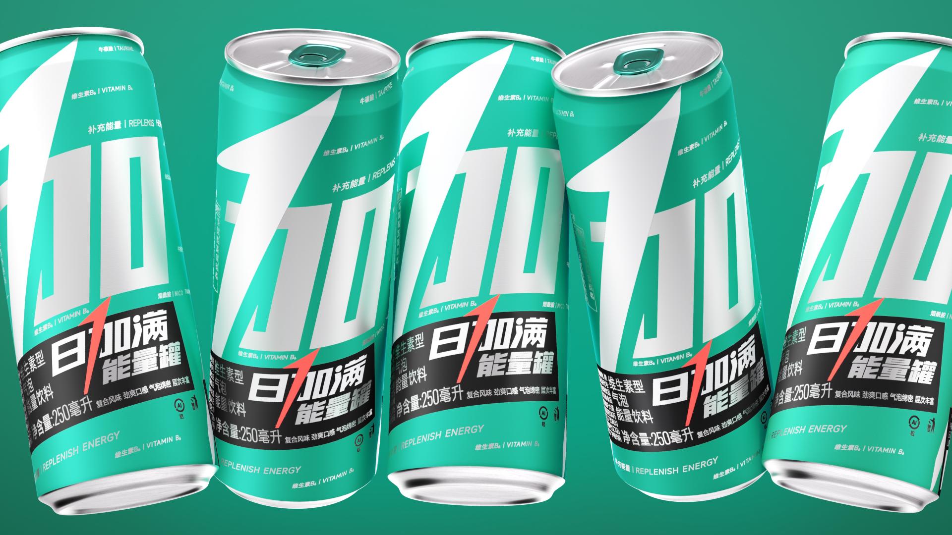
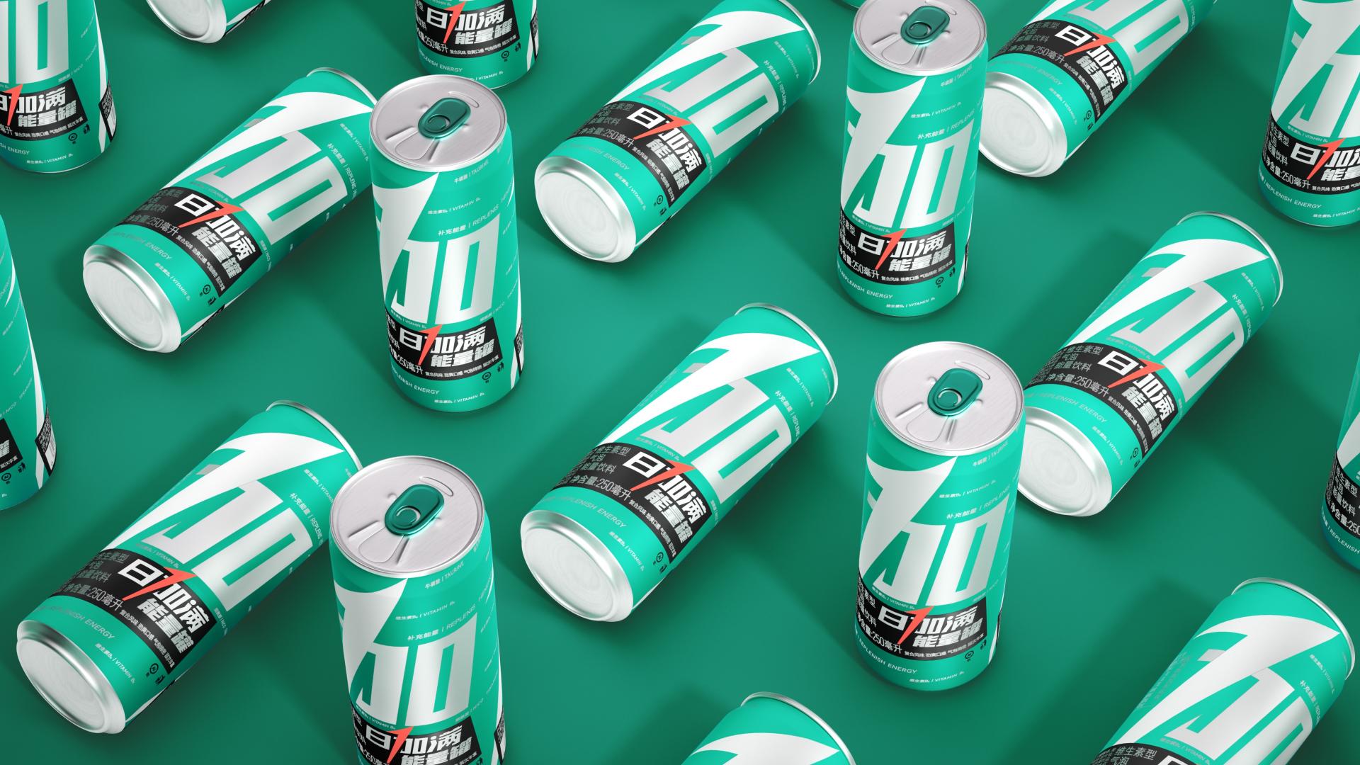
In the crowded energy drink market, where many products suffer from homogenization, this brand upgrade aims to create a highly recognizable symbol for “Ichimore”. This enhancement facilitates easy identification from a distance while lowering communication costs.
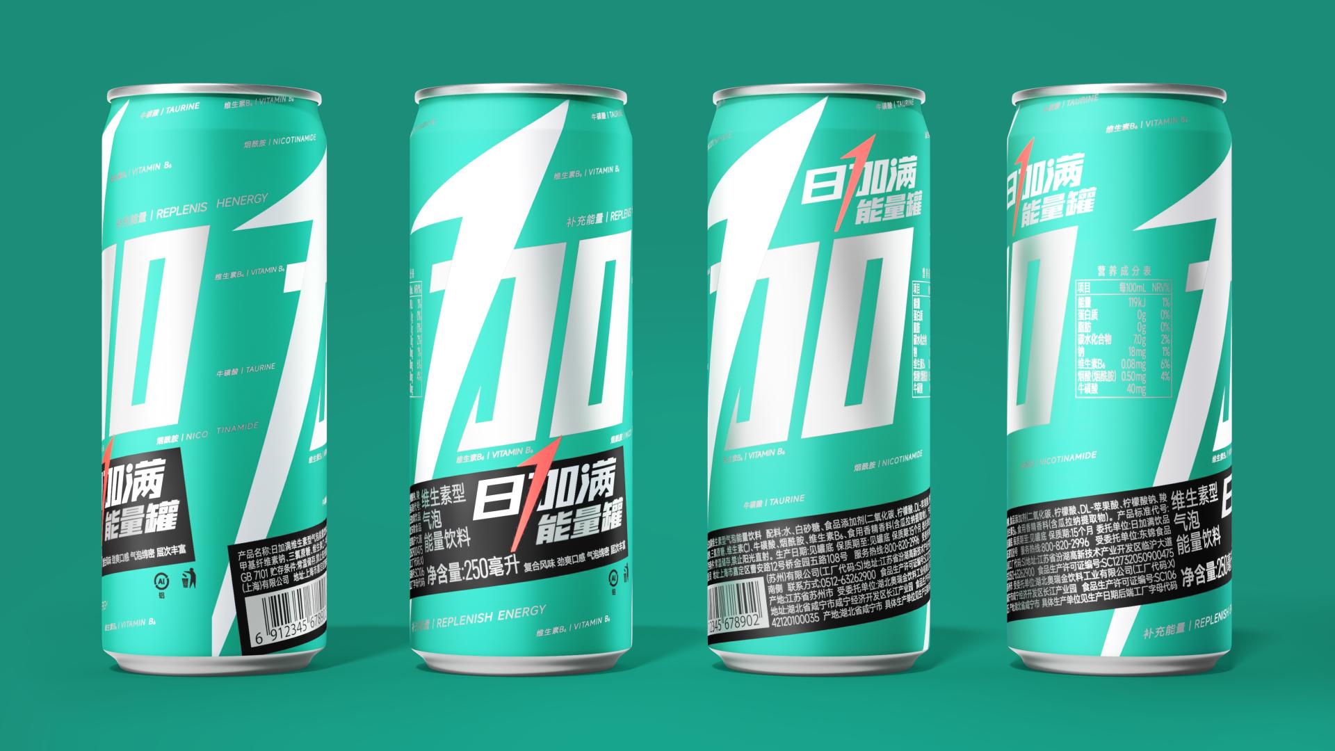
The central idea of this upgrade is to simplify the product's presentation. By focusing on the character "+" (meaning "add" or "boost"), we emphasize the concept of energy enhancement, making the brand more appealing and memorable to consumers. This shift aims to differentiate the product in a saturated market.
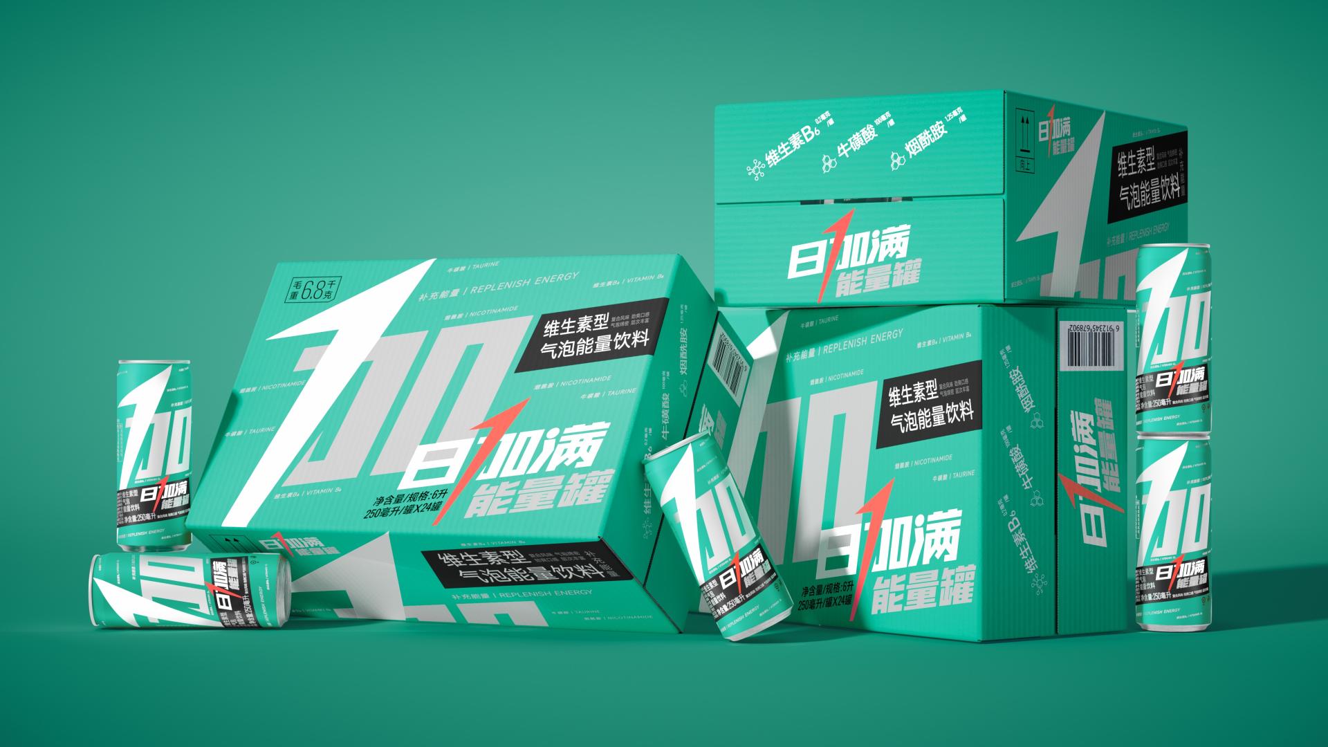
Our design employs a minimalist strategy, stripping away unnecessary information from the original packaging. The character "+" is maximized in size to serve as the primary brand symbol, reflecting the product's energy-boosting essence. We also integrated "+" with "100" to underline its professional energy supplementing capability. The Swiss-style typography facilitates efficient readability through a clear hierarchy of information.
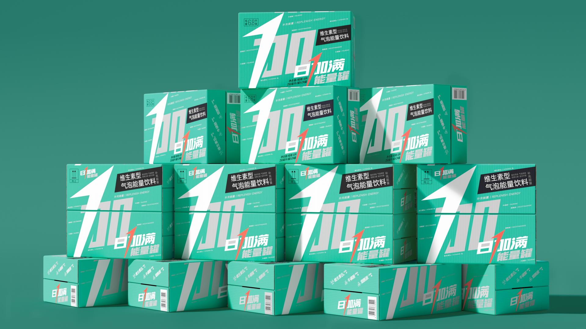
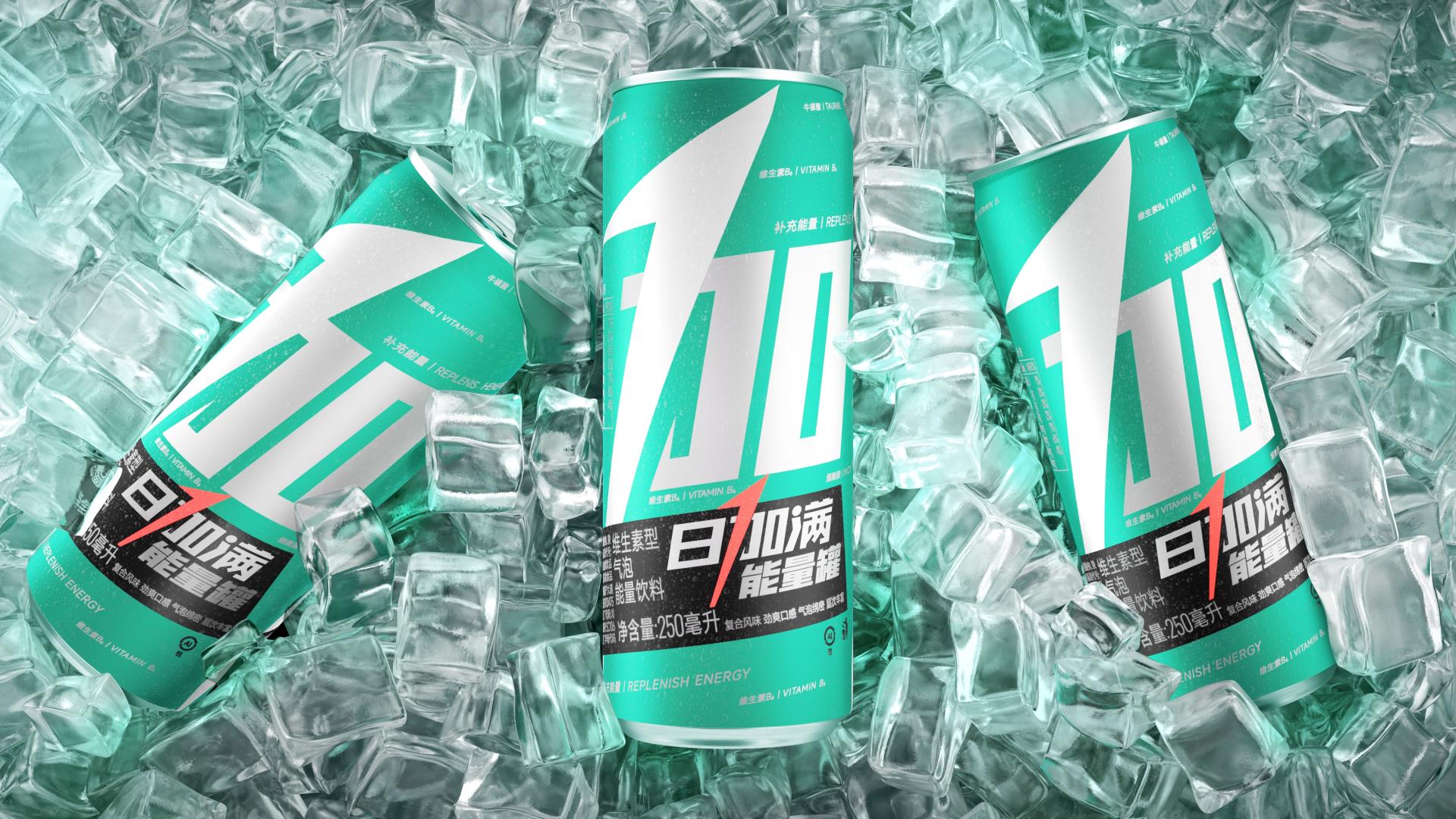
The new packaging serves not only as an eye-catching display but also as an effective communication tool. The bold use of color—large areas of green paired with high-saturation orange—evokes a sense of vitality and sportiness, ensuring the product stands out on retail shelves while conveying its energetic purpose.
This upgrade positions "Ichimore" uniquely in the market by eliminating clutter and focusing on a singular, powerful symbol. The integration of the character "+" and its association with energy sets it apart from competitors, reinforcing the brand's identity and enhancing consumer recognition.
The logistics box design complements the packaging strategy, exposing the brand symbol on five sides to maximize visibility during in-store stacking. This thoughtful approach not only enhances brand presence but also reduces future communication costs, aligning with sustainable practices by minimizing the need for excessive marketing materials. Through this brand upgrade, "Ichimore" presents itself with a youthful, distinctive packaging that resonates with consumers.
Credits

Entrant
Great Circles Interior Design
Category
Interior Design - Living Spaces

Entrant
Bezalel Interior Design
Category
Interior Design - Residential


Entrant
Yijia Xu
Category
Conceptual Design - Architectural

Entrant
OOKADA / MUMU interior design
Category
Interior Design - Residential
