2024 | Professional
Jinkuang Natural Mineral Water
Entrant
Shenzhen Tigerpan Design Co., Ltd
Category
Packaging Design - Non-Alcoholic Beverages
Client's Name
Jinmailang Beverage Co., LTD
Country / Region
China
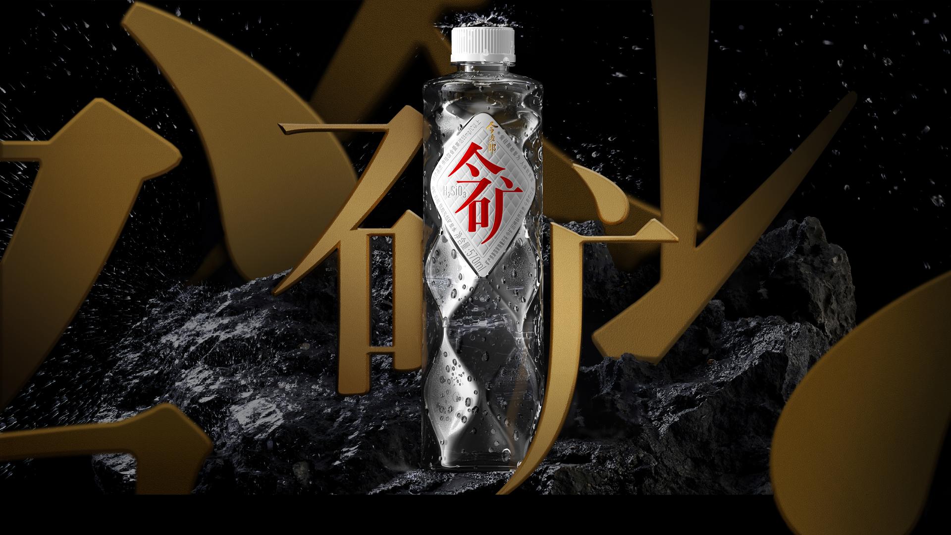
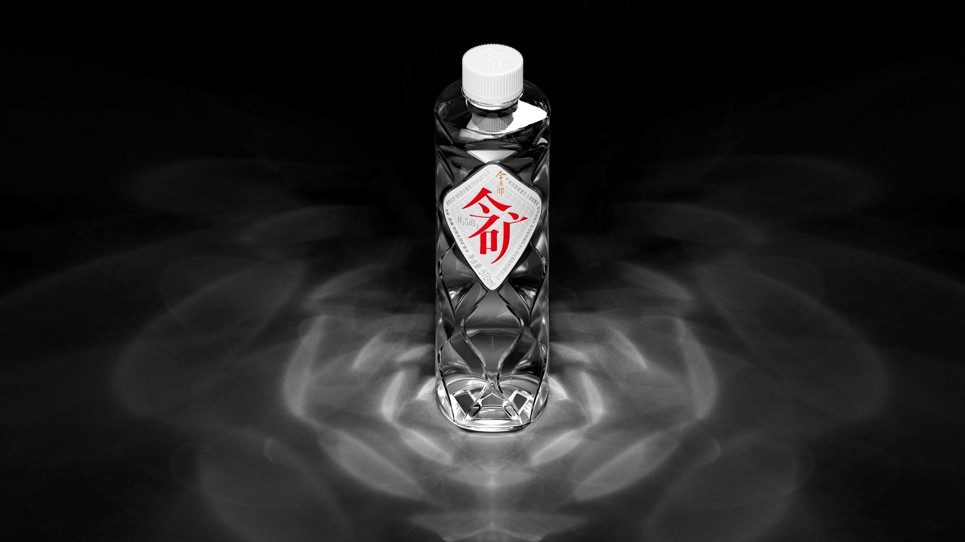
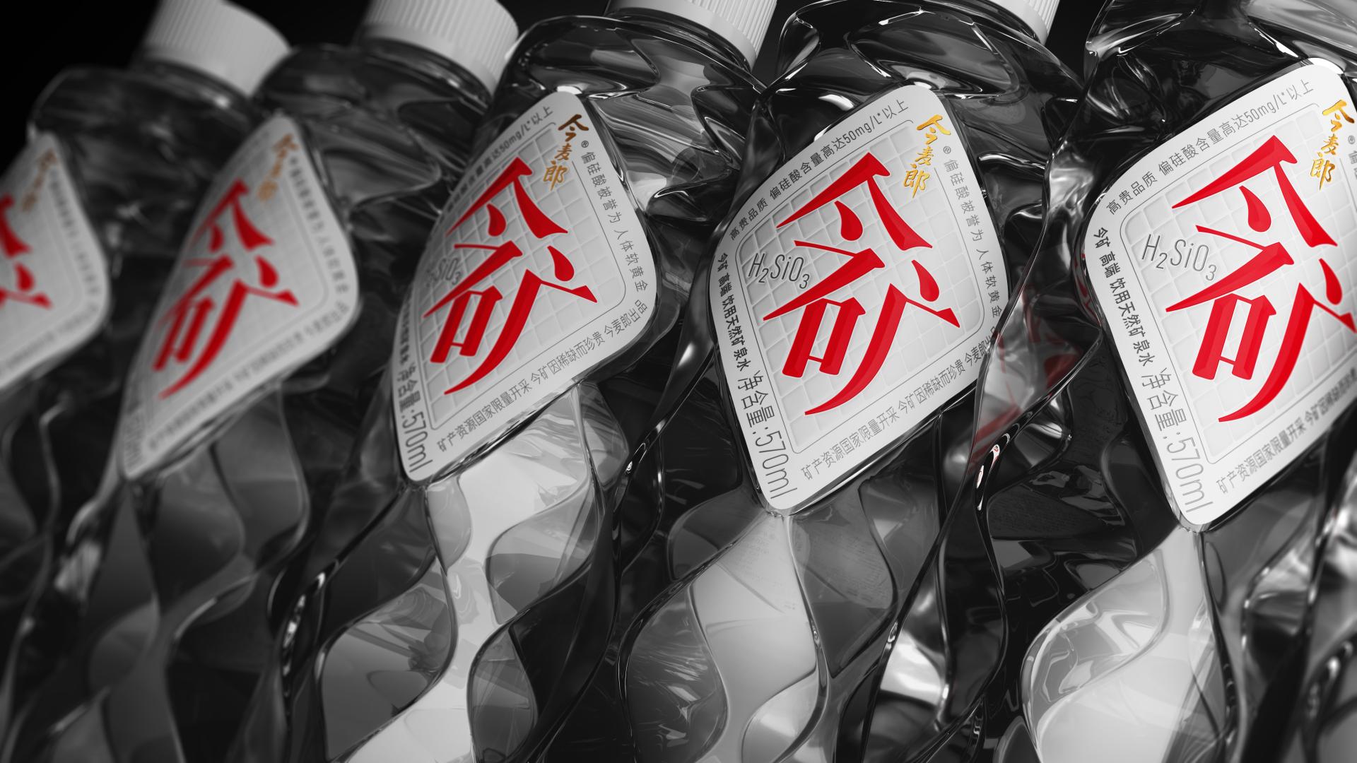
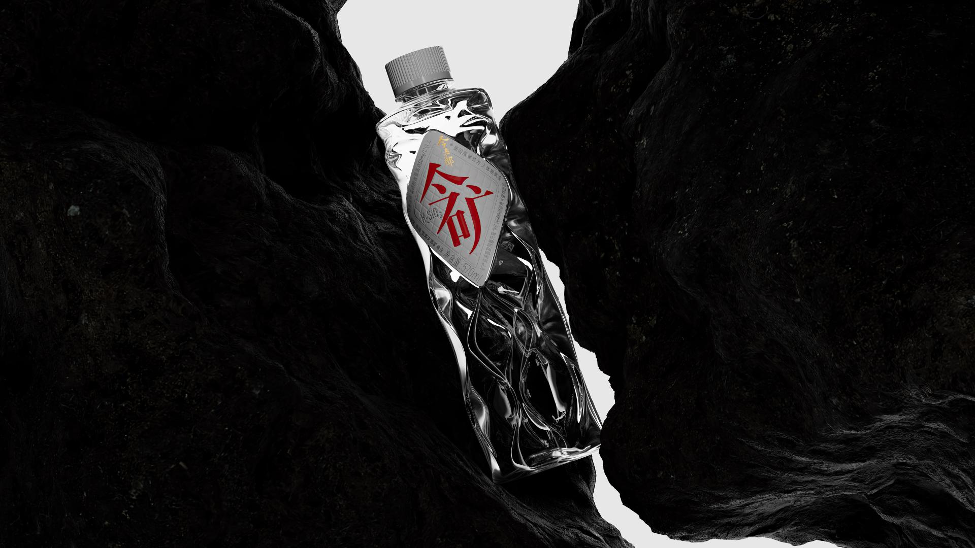
The design was inspired by the "bug" of the world -- the perfect laminar flow phenomenon. (When water molecules move slowly and regularly in the same direction, they create a stream that appears to be completely stationary.) The bottle is designed to break the boundary between movement and stillness. The lines on the bottle transit from dense to sparse from top to bottom, like a cluster of flowing spring water. It is a section of water flow, with beautiful scattering and refraction lights when the bottle is lit up by any light beam. At the same time, the ups and downs of the curve can also fit the palm better, creating a more comfortable and stable grip. The label of the bottle mainly shows the beauty of the Chinese character, Jin Kuang ( meaning Jinmailang’s mineral water) reflecting the confidence of Chinese culture in the brand connotation. Using the technique of shared calligraphy strokes, the product name "Jin" and "Kuang" are artfully combined together, which to Chinese consumers, becomes a remarkable symbol. The colors are the most traditional Chinese color combo, gold and red. With clean and natural white, the whole bottle of water conveys the noble temperament of Chinese style. In detail, gold-stamping and embossment are used to enhance the bottle’s perception accuracy, where consumers can easily feel it when touching it.


Credits
Entrant
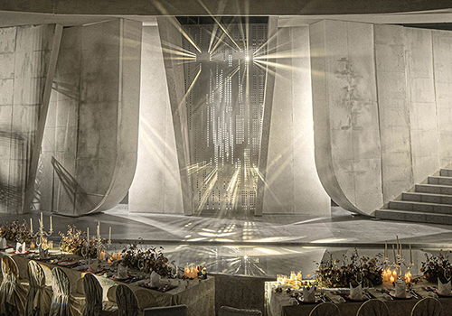
Destiny Wedding Planner
Category
Interior Design - Stage
Entrant
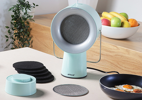
Smart Product Concepts Limited
Category
Product Design - Kitchen Accessories / Appliances
Entrant
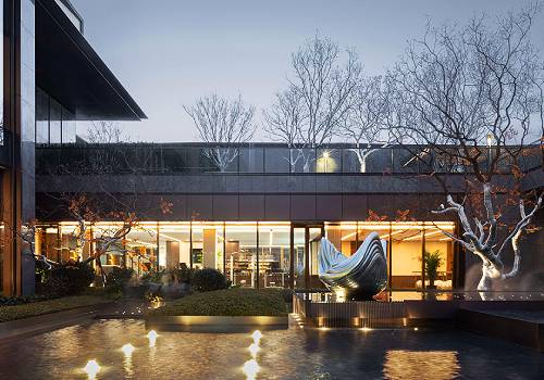
HZS Design Holding Company Limited
Category
Architectural Design - Institutional
Entrant
GAMUSTUDTIO
Category
Interior Design - Residential