2024 | Professional

GMN ESSENTIAL OIL PATCHES
Entrant
Chongqing Juxiang Brand Management Co., Ltd
Category
Product Design - Personal Care
Client's Name
Chongqing Juxiang Brand Management Co., Ltd
Country / Region
China
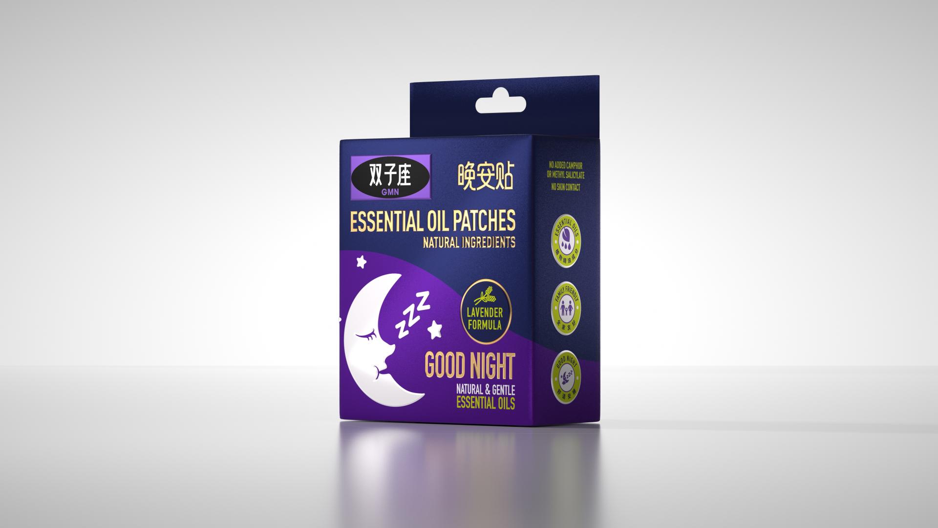
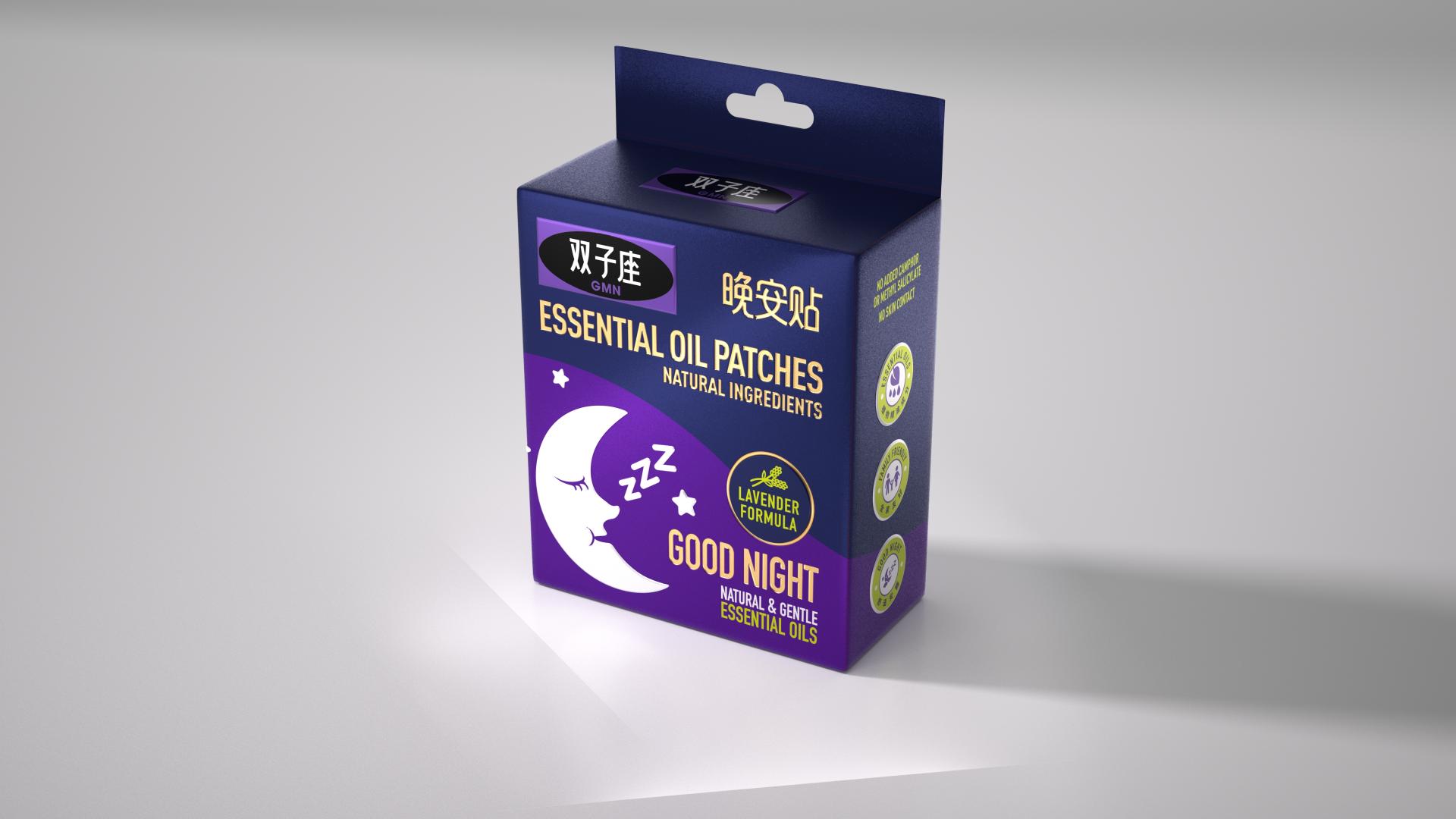
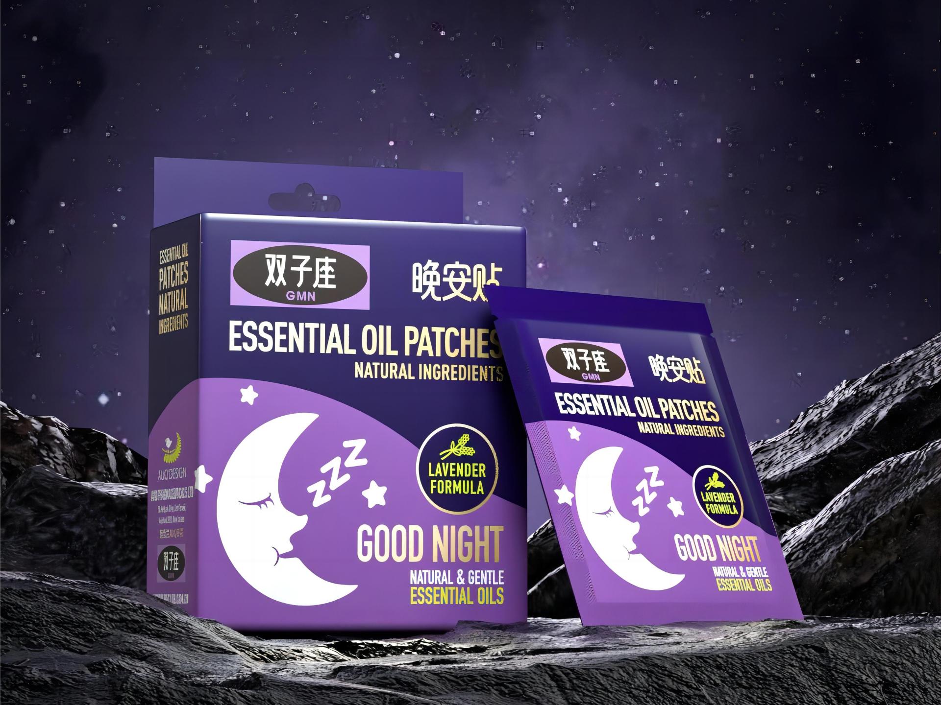
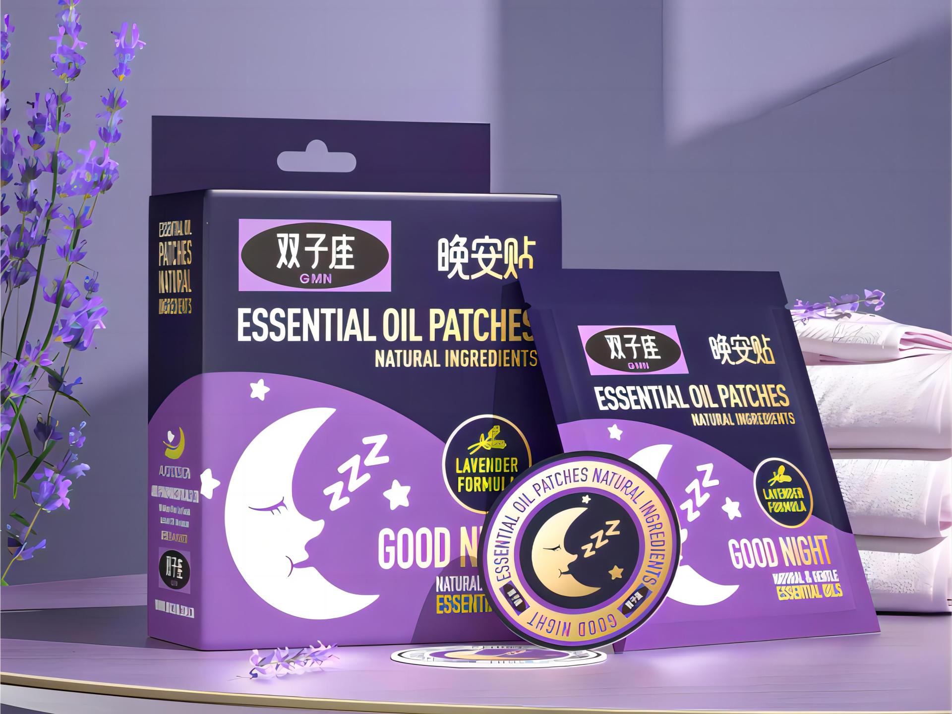
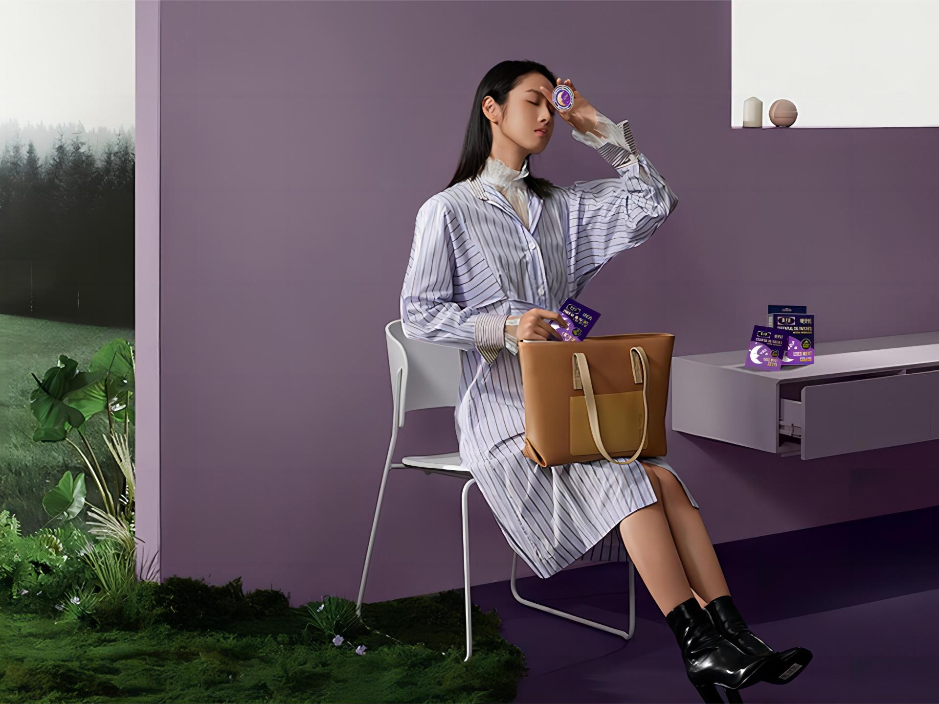
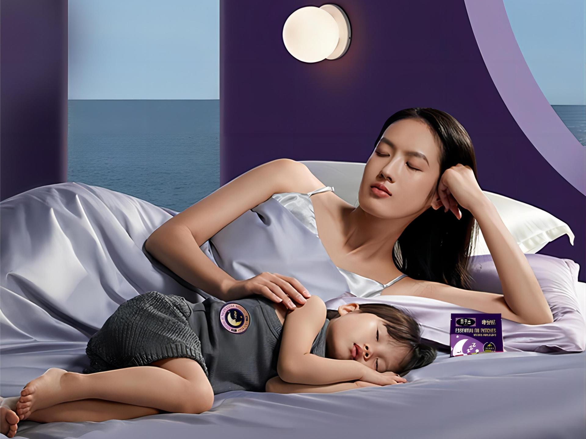
This packaging is designed exclusively for the soothing essential oil patch, with the aim of allowing users to immediately feel the product's effectiveness just by looking at the packaging. To create a sleep-inducing atmosphere and emphasize the product's ability to assist with sleep, black and purple were used as the base colours, along with a sleeping moon pattern. The purple colour on the lower part of the package represents the sea of lavender, which is a reminder of the lavender essential oil used in the product.
Additionally, the product's name is labelled in both English and Chinese on the front of the box, highlighting its natural and soothing essential oil ingredient, which captures the user's attention. By directly printing the introductory text on the package, the need for additional explanatory material is eliminated, reducing waste and implementing the concept of sustainable development.

Credits

Entrant
Mu Dong
Category
Interior Design - Showroom / Exhibit

Entrant
Cultural Path Ltd.
Category
Product Design - Educational Tools / Teaching Aids / Learning Devices
Entrant
AA DESIGN
Category
Interior Design - Healthcare

Entrant
Wuxi House Aesthetics Decoration Engineering Co., Ltd
Category
Interior Design - Residential