2026 | Professional

Teplo - Packaging Design for a Handmade Candle Brand
Entrant
Uliana Mukhitdinova
Category
Packaging Design - Conceptual Design
Client's Name
Country / Region
Russia
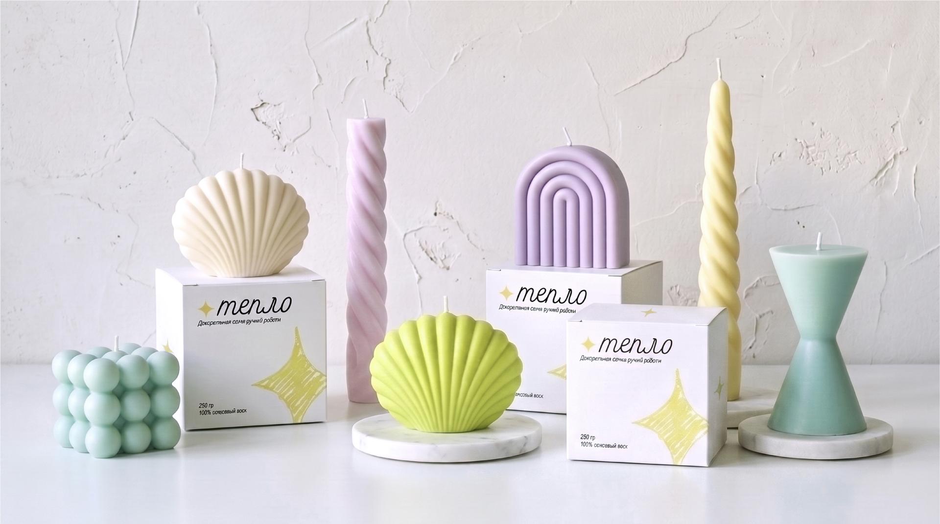
Teplo is a handmade candle brand created to evoke comfort and emotional connection while adding a decorative presence to the home. Derived from the Russian word for “warmth,” the name expresses the core idea behind the brand. Its candles are produced in small batches and are distinguished by their unique shapes, bright colors, and handcrafted character. The brand combines simplicity, sincerity, and comfort with a more creative and expressive personality.
As a new brand with limited budget and small‑batch production, Teplo needed an identity and packaging concept that communicates its handmade nature and emotional values while remaining recognizable, scalable, and economical to produce. The visual identity is built around a hand‑sketched graphic language that translates the intimacy and slight imperfection of handmade production into a flexible visual system.
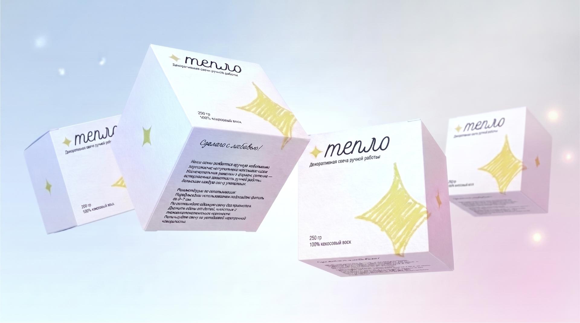
The main symbol is a star‑like form inspired by candlelight. In the logo version, it is simplified enough to read as a clear graphic shape from a distance, while its hand‑drawn quality becomes visible on closer inspection. The star is paired with a handwritten word-mark to reinforce the human quality of the brand. The supporting typography is set in an italic typeface, echoing the handwritten rhythm and tying the text elements together. A looser, more expressive variation of the star is used at a larger scale on the packaging. It deliberately breaks the physical boundaries of the box, continuing from the front panel onto the adjacent sides. This reflects the way candlelight expands and radiates outward, suggesting an energy that cannot be contained.
A cool yellow serves as the key accent color, referencing light while giving the identity a creative character. Grounded in intentional simplicity, the identity uses minimal typography and graphics to reduce printing costs without compromising visual distinctiveness. The resulting identity is both economical and expressive, with a coherent system that can extend across packaging, social media, and other brand touchpoints.


Credits
Entrant
IM Interior Design Company
Category
Interior Design - Restaurants & Café

Entrant
GANDAN DESIGN
Category
Interior Design - Residential
Entrant
Hong Kong Yonghuicui Home Furnishings, Ltd.
Category
Product Design - Textiles / Floor Coverings
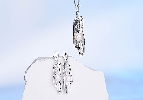
Entrant
Lijiang BSF Silver Jewelry Co., Ltd.
Category
Fashion Design - Jewelry