2025 | Professional
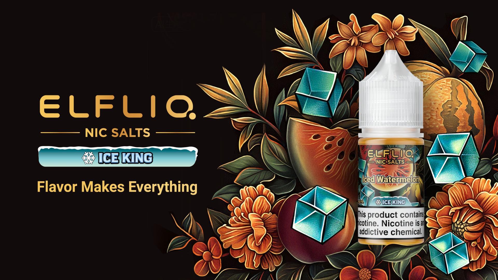
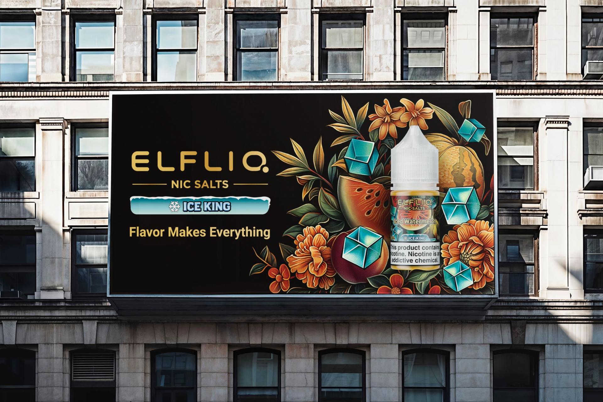
Ice King · Artistic Coolness
Entrant
HG Innovation Limited
Category
Product Design - Product Poster
Client's Name
HG Innovation Limited
Country / Region
Hong Kong SAR
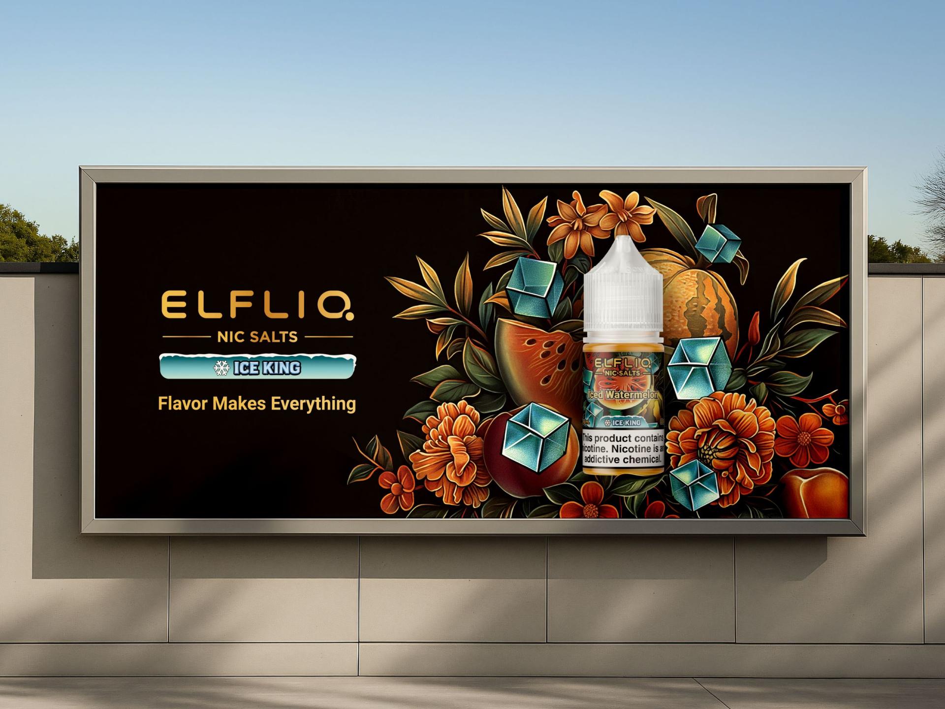
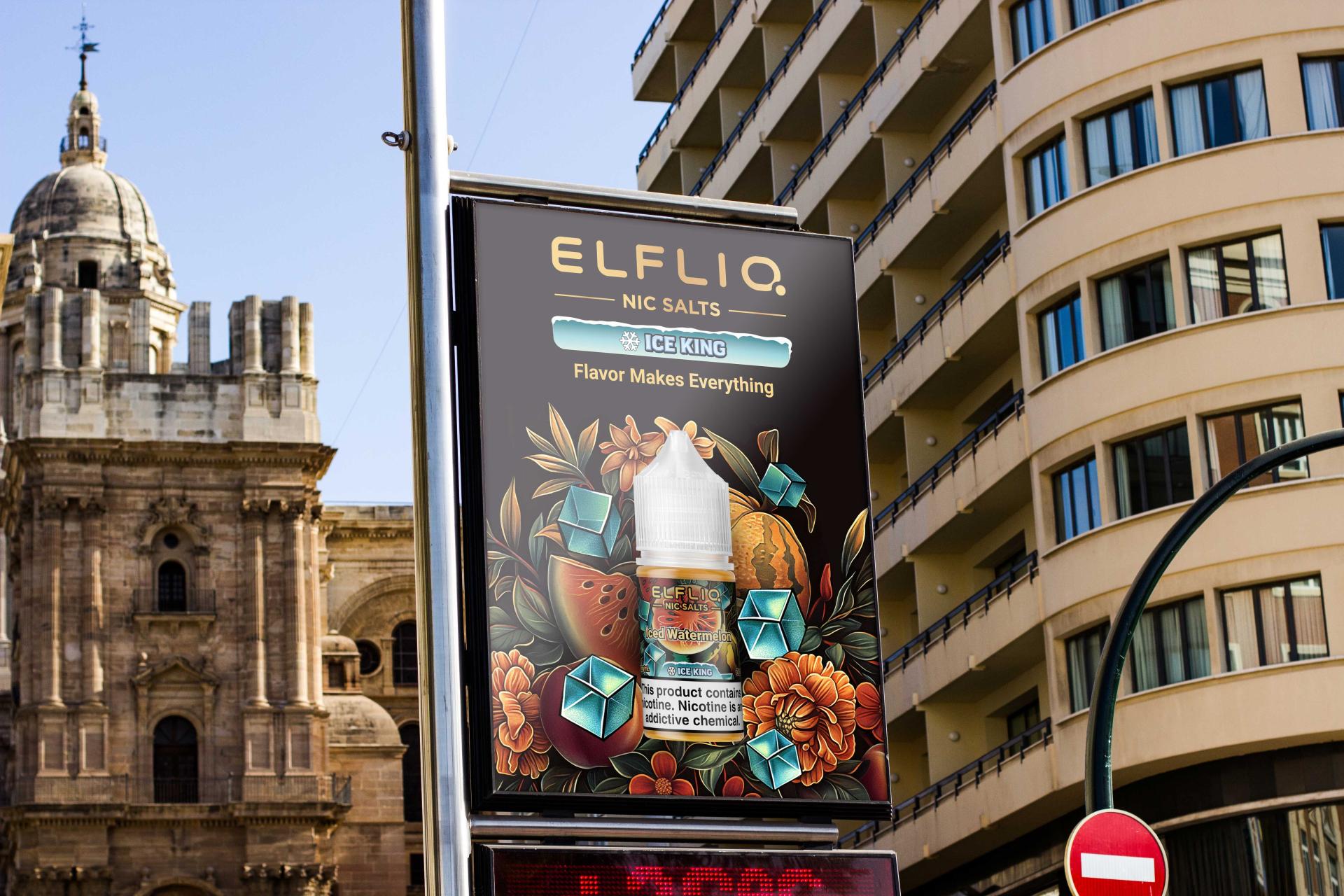
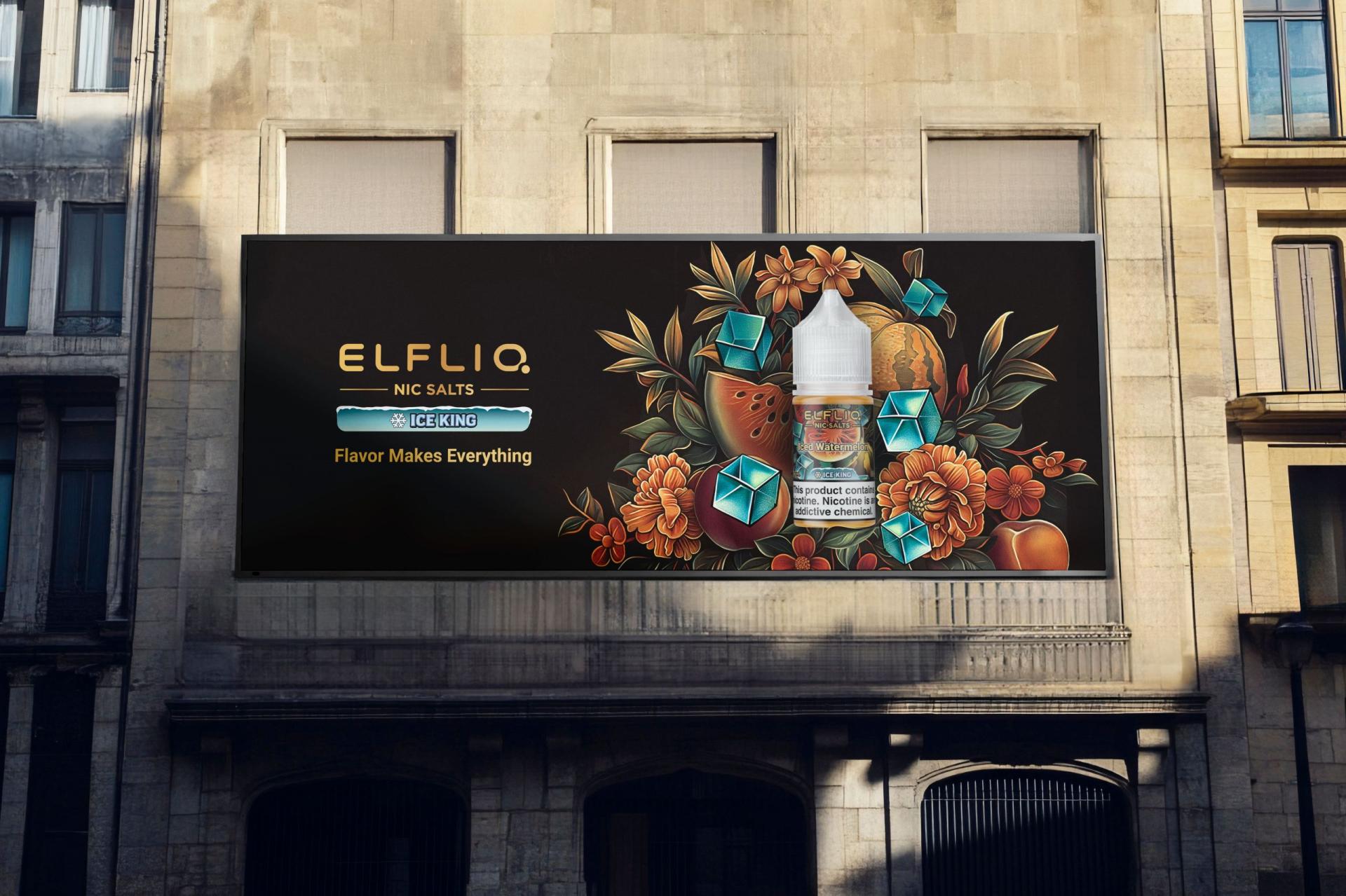
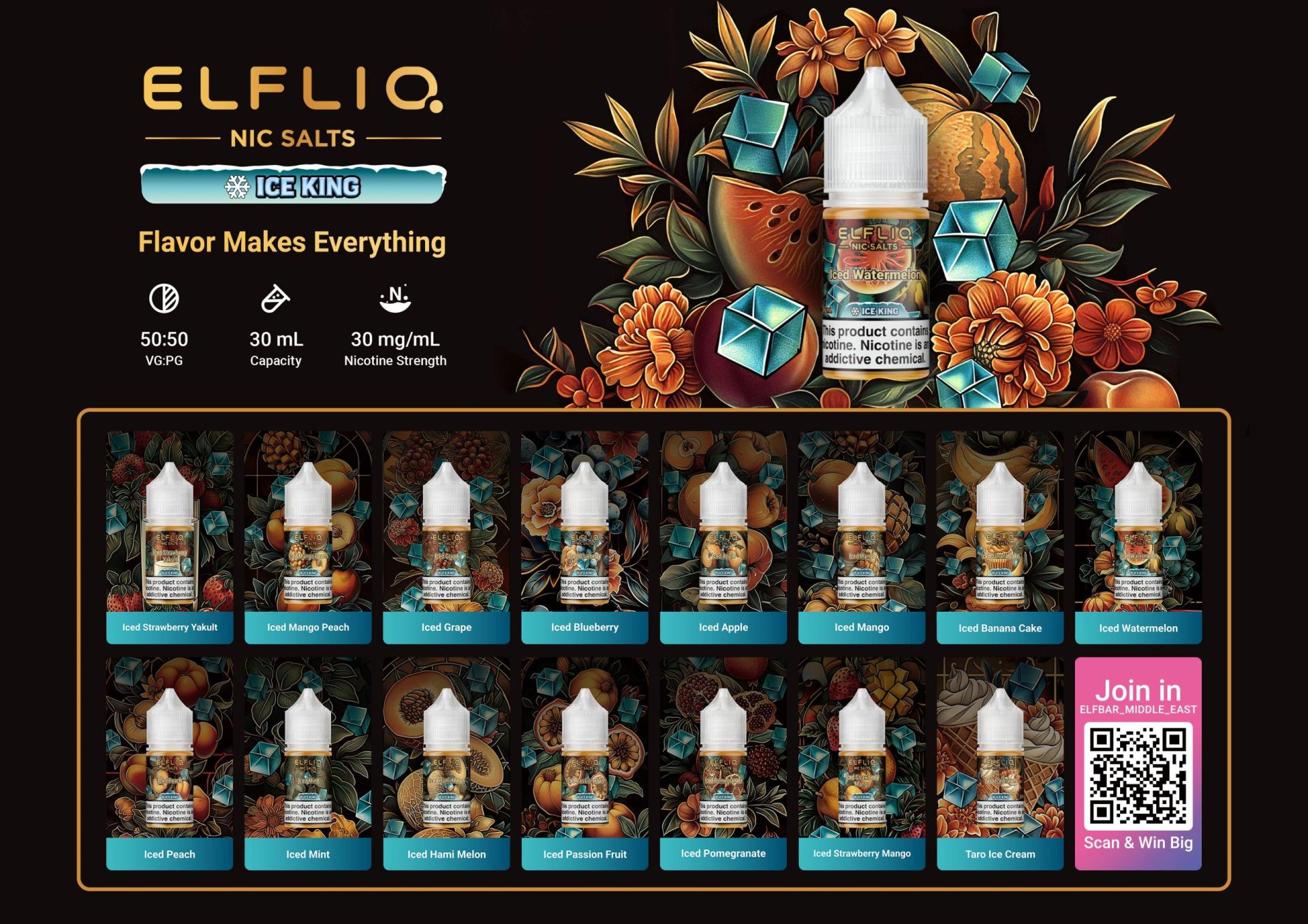
With the growing popularity of nicotine salt e-liquids, consumers now have higher expectations for the aesthetics and recognizability of e-liquid packaging. Traditional packaging designs — simple, indistinct, and lacking collectible appeal — can no longer meet market demand. In response, this design revitalizes the packaging through artistic illustration, elevating it into a collectible object that embodies the brand’s aesthetic vision.
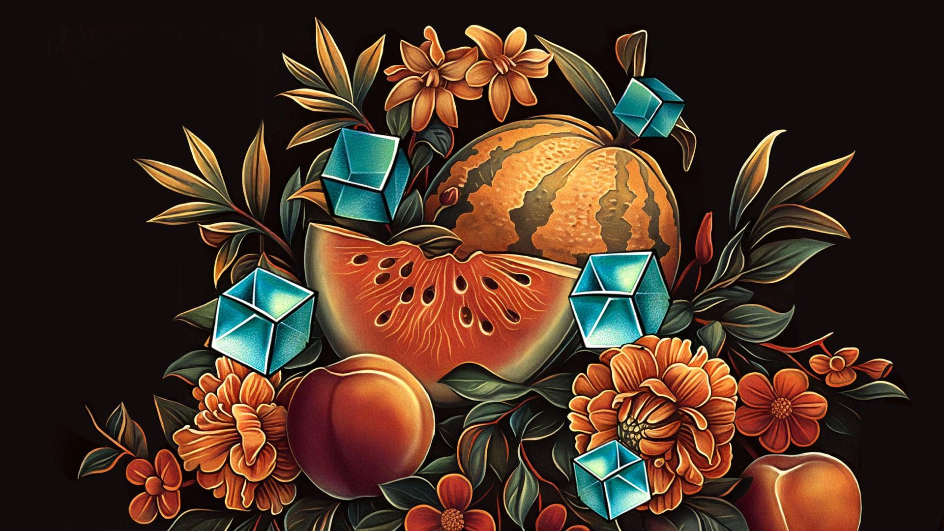
Themed “Ice King · Artistic Coolness,” the design draws inspiration from the seamless fusion of Art Nouveau illustrations and ice beverage culture. Art Nouveau illustrations, with their intricate detailing and flowing curves, lend the packaging a vintage, luxurious artistic appeal. Fruit imagery serves as a direct symbol of flavor, while geometric ice cubes and metallic typography add clear taste cues, collection value, and an artistic atmosphere — striking a harmonious balance between functionality and aesthetic expression. The color scheme follows the principle of “flavor signature color + ice blue + metallic accents”: the primary color represents the signature fruit color of each flavor, the secondary color pairs a dark background with green leaves, and accent colors include ice blue tones and a metallic gold logo. This ensures a consistent color scheme across the series and distinguishes different flavors. In composition, the fruit illustration is enlarged and centered as the visual focus, while geometric ice cubes add a modern touch and evoke a sense of coolness — highlighting the product’s refreshing quality. Together, these elements create packaging that is refined, visually striking, and rich in artistic expression
Entrant
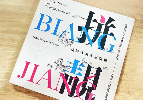
Taiwan Hakka Culture Development Center, Hakka Affairs Council
Category
Conceptual Design - New Category: Exhibition Album & Collection
Entrant
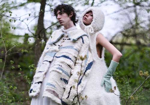
JUNE JUYEON KIM
Category
Fashion Design - Textile & Materials (NEW)
Entrant
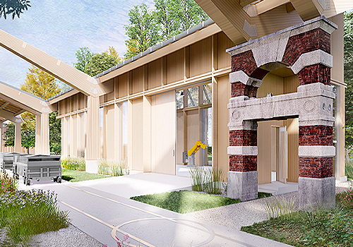
Xueyuan Wang, Justin Fan
Category
Architectural Design - New Category: Historic Preservation/Adaptive Reuse
Entrant
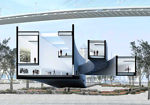
Yijia Xu
Category
Conceptual Design - Architectural